



Choosing Christmas colours is not simply about finding two shades that look attractive together. An effective palette must work with the room’s lighting, the materials used in the decorations, the scale of the space and the atmosphere you want to create.
A practical method is to select one dominant colour, one supporting tone and one accent. These should be combined with a limited number of materials, each serving a specific purpose: absorbing light, reflecting it, introducing movement or connecting different areas.
What the Christmas 2026 trends indicate
The official Christmasworld Trends 26+ do not prescribe one compulsory festive style. Instead, they present three directions — brave, light and solid — connected by an emphasis on responsible materials, durability and a closer relationship with nature.
Brave combines copper, reds, violets and textured surfaces. Light explores matte silver, transparent effects, misty pastels and darker nature-inspired tones. Solid brings together white, pure colours, geometric forms and metals such as steel and aluminium.
Christmasworld’s official 2026 festive report also highlights cream, wine red and burgundy paired with gold, black and metallic finishes, alongside soft textures such as velvet, wool and flocked surfaces.
These directions should be interpreted around the space rather than copied as a rigid formula. Explore the official Christmasworld Trends 26+.
Palette 1: burgundy, cream and warm gold
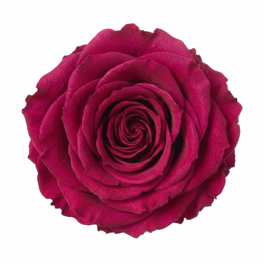
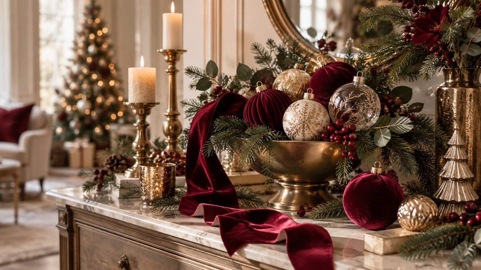
This is the strongest option for an elegant, warm and theatrical Christmas scheme. Burgundy creates depth and can be used on the main decorations. Cream and ivory provide visual breathing space, while warm gold introduces controlled points of light.
Recommended materials
- velvet or flock for baubles, bows and deep accents;
- transparent or decorated glass for lightness;
- gold-coloured metal as a highlight;
- fabric ribbons to distribute colour;
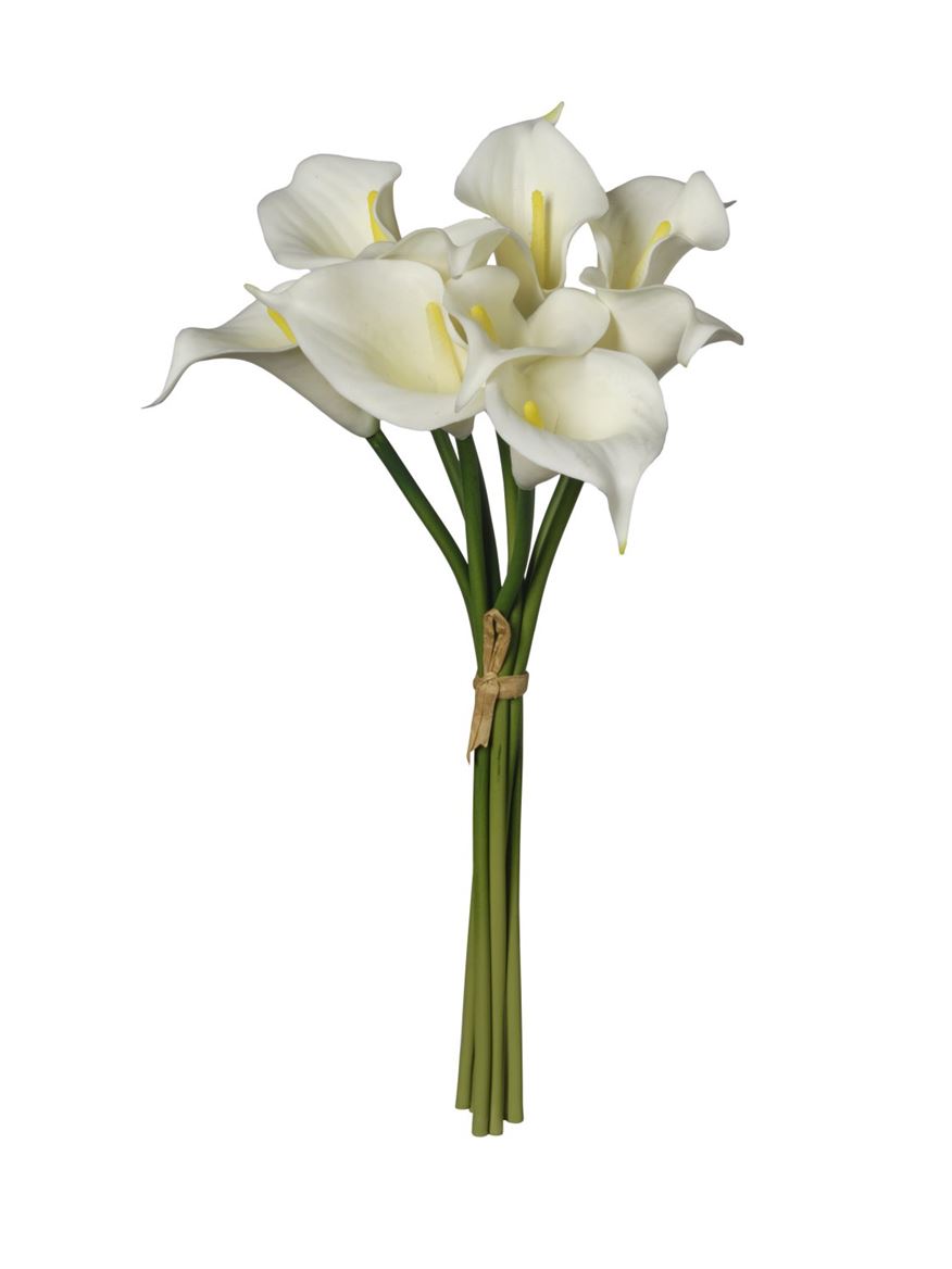
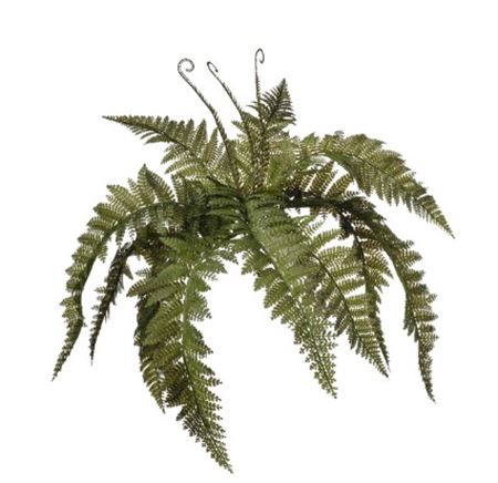
- green botanicals as a natural foundation.
The colours should not carry equal weight. Burgundy can dominate, cream should create pauses and gold should be limited to areas intended to catch the light.
This palette works well for statement trees, festive tables, entrances, hotels, restaurants and sophisticated shop windows.
Palette 2: matte silver, misty pastels and deep green
This combination creates a lighter, brighter and more contemporary Christmas atmosphere. Matte silver reflects light without becoming excessively brilliant. Misty pastels introduce softness, while deep green or another dark natural tone prevents the composition from feeling cold.
Recommended materials
- transparent, satin or frosted glass;
- matte metals and gently reflective surfaces;
- lightweight or translucent ribbons;
- paper, ceramics and textiles in neutral shades;
- simple botanical branches and shapes.
It is suited to minimalist interiors, smaller spaces, bright shop windows and schemes where the composition needs room to breathe. In a small room, use the darkest tone only as an accent. In a large setting, it can become a more structural part of the design.
Palette 3: copper, red and violet
This is the most expressive of the three palettes. Copper creates a bridge between intense reds, violet and natural tones, producing a rich scheme without relying on the traditional red-and-gold combination.
Recommended materials
- polished or satin copper finishes;
- textured and craft-inspired decorations;
- coloured glass;
- velvet used in controlled quantities;
- wood, paper and botanicals to balance the intense colours.
This palette is particularly effective for shop windows, events, winter weddings and spaces that need to remain distinctive in photographs.
When colours are highly saturated, leave some neutral areas. Cream, natural brown or deep green can provide the background that allows the stronger tones to stand out.
How to choose materials
Each material should perform a clear role:
- velvet and flock: absorb light and create depth;
- glass: introduces transparency and lightness;
- metal: creates highlights and defines the style;
- ribbons: connect colours and separate areas;
- botanicals: establish the structure of the composition;
- paper and textiles: carry the palette onto tables and packaging.
Choose one main material and one or two supporting materials. Repeat them at different intensities across the tree, table, entrance or shop window.
A five-step palette test
- Choose three words that describe the atmosphere you want.
- Select one dominant colour, one supporting colour and one accent.
- Combine one matte material with one reflective material.
- Test the elements together under the room’s actual lighting.
- Photograph the composition and check whether one colour is overpowering the others.
Mistakes to avoid
- using too many colours at the same intensity;
- combining several competing metallic finishes;
- selecting decorations individually without testing them together;
- distributing every colour with perfect uniformity;
- adding products simply to fill empty spaces;
- ignoring lighting, circulation and the proportions of the room.
Frequently asked questions
How many colours should a Christmas palette contain?
Three are usually enough: a dominant colour, a supporting tone and an accent. Related shades can be added as long as they do not become competing colours.
Can gold and silver be used together?
Yes, but one should remain dominant. Use the other only for small reflections or selected details.
How can different rooms feel coordinated?
Repeat at least one colour and one material throughout the spaces, while changing their quantity and scale.
Can oversized baubles be included in these palettes?
Yes. Treat them as focal points rather than decorations to distribute evenly. See our guide to oversized velvet baubles for sizes, quantities and placement.
For a complete room scheme, read our guide to an alternative Christmas interior.
For the home: explore the MyFlower Christmas selection and choose products around a defined palette rather than quantity.
For shops, hotels, restaurants and events: discover My Flower Pro and develop a scheme around the venue, circulation and visual identity.